Philbin
Philbin was the number 1277 surname in Ireland in 1911. This includes possible variations Philbin, MacPhilbin, McPhilbin and O'Philbin. The number of people with this surname were less than 1,000. As a result, only population distribution and religious breakdown are shown.
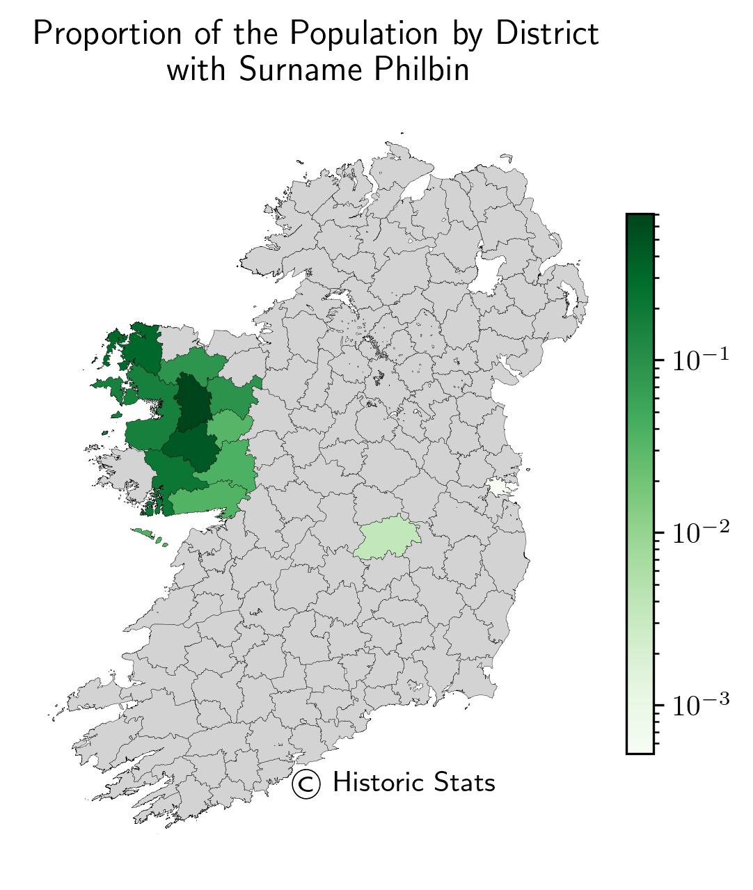
1. Proportion of Population by District

The map here shows the proportion of the population with surname Philbin by district which were also known as the Poor Law Unions. The proportions shown use scientific notation where the colour map uses a log norm which is discussed in the methodology section which can be viewed using the link above.
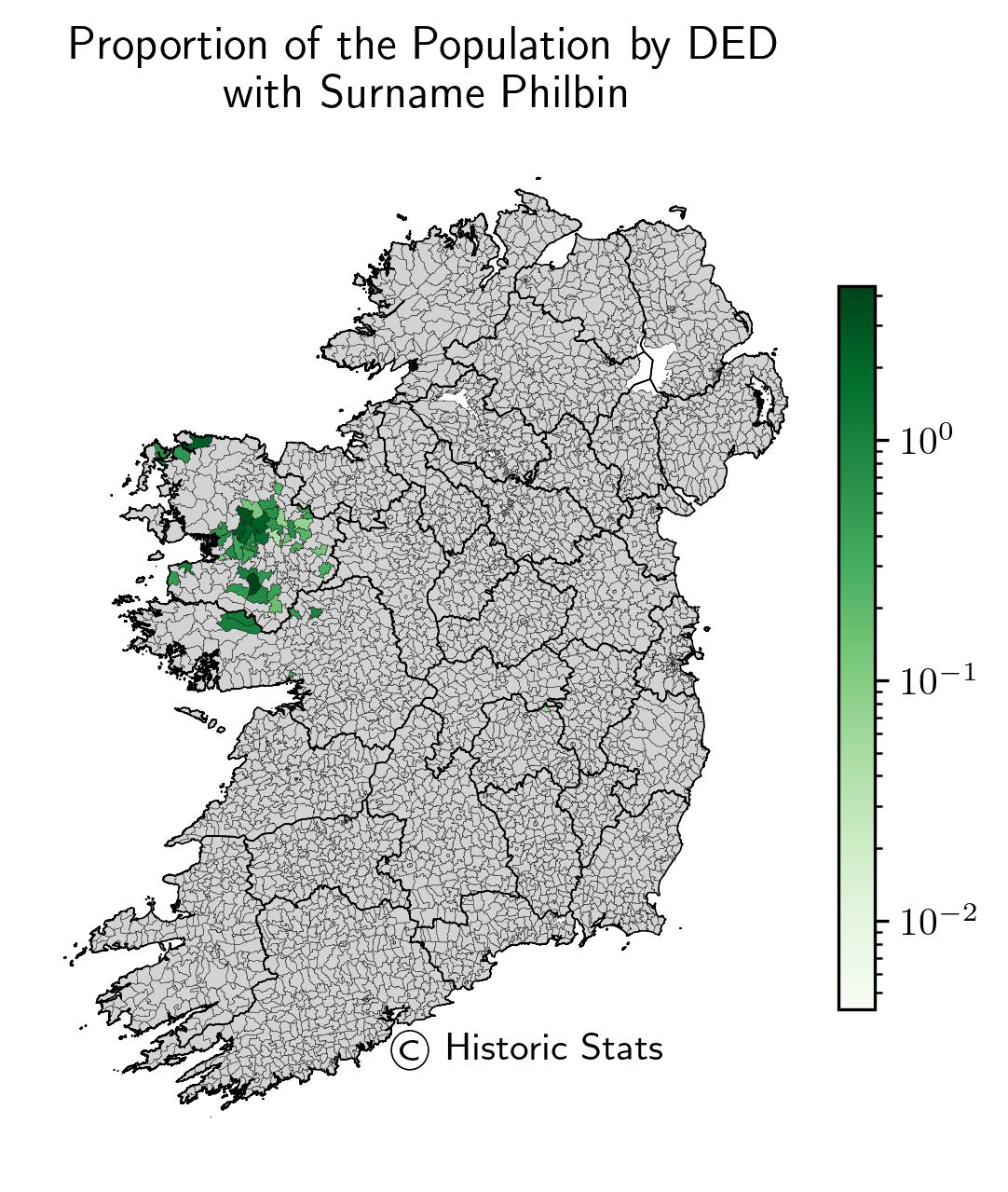
2. Proportion of Population by DED

The map here shows the proportion of the population with surname Philbin by DED. The proportions shown use scientific notation where the colour map uses a log norm which is discussed in the methodology section which can be viewed using the link above.
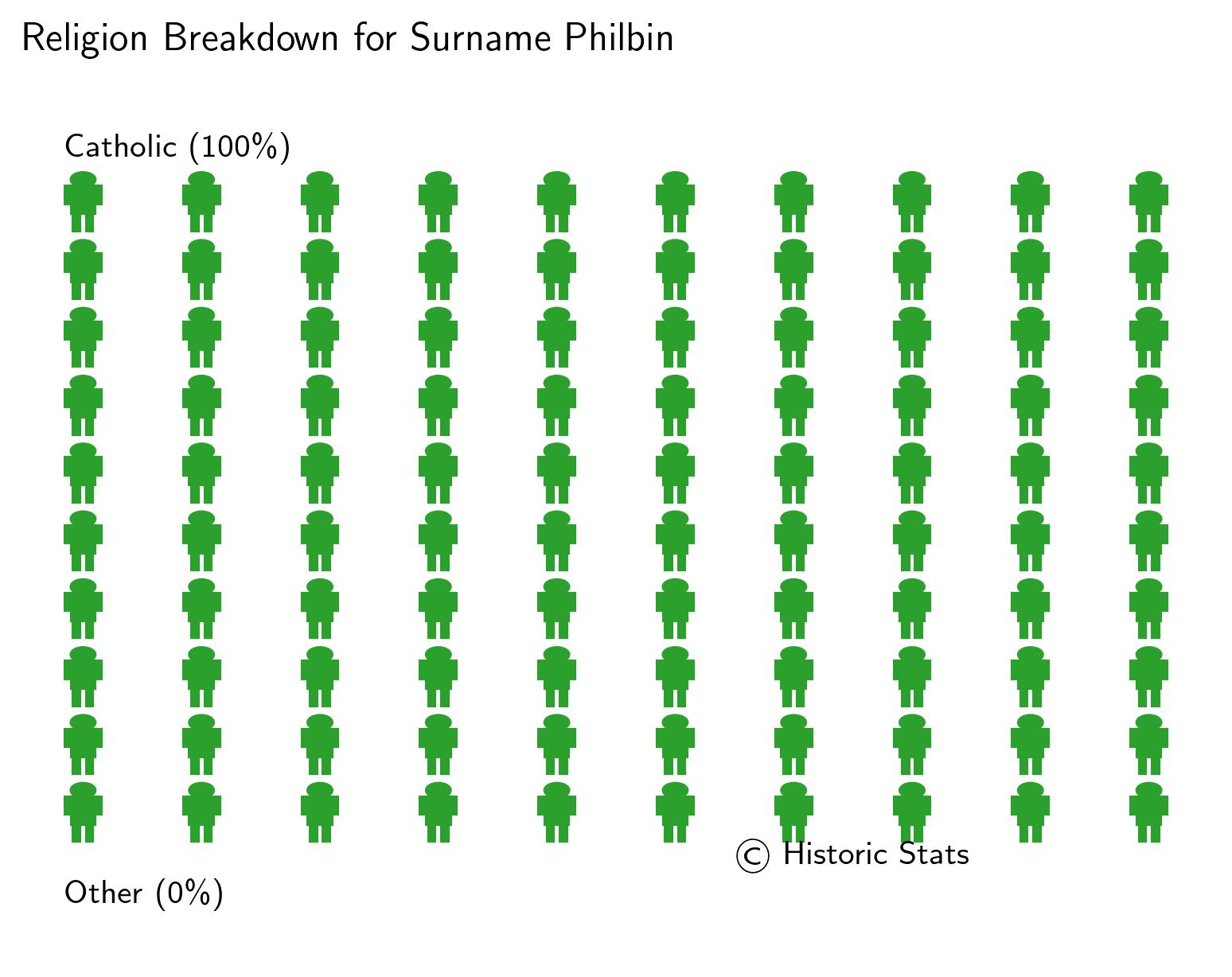
3. Religious Breakdown

The image shown is the religious breakdown for the population with surname Philbin. Each religion has been rounded to the nearest whole percentage and any religion less than 3% has been classified as other.
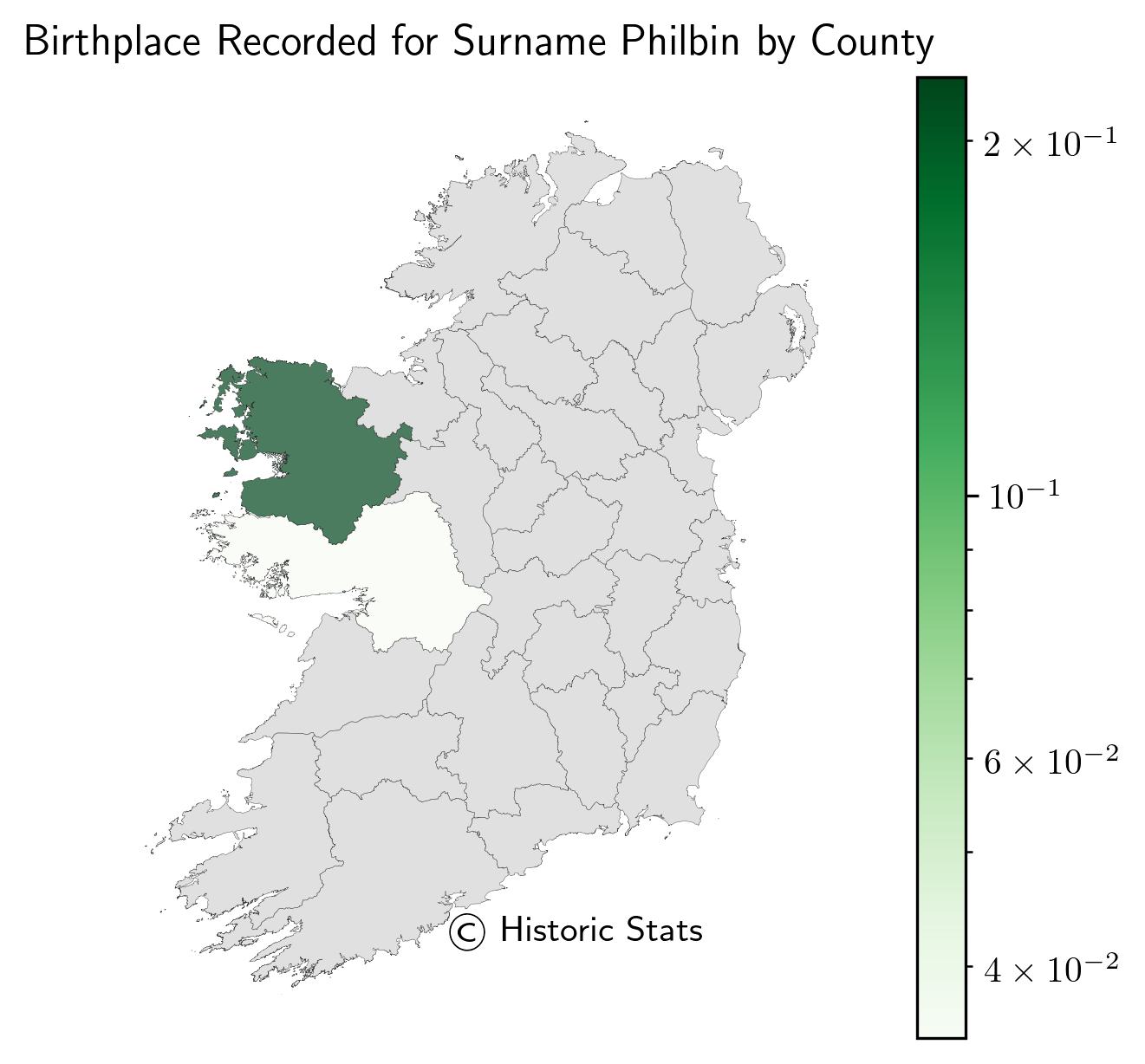
4. Birthplace by County

The map shown here was the proportion of the population with surname Philbin who were born in each of the counties in Ireland. Unlike the proportion of the population above, this is the reported birthplace on the census. The proportions shown use scientific notation where the colour map uses a log norm which is discussed in the methodology section which can be viewed using the link above.